I would say this is a clever idea, a clever idea by Sametime 7:15. When Michael Lease showed our class his side project, I found it very likable in a diarist sense, a moment captured in a split second, the documentation of the life we walk upon. What is great about this work is that it goes out side the whole "fine art" story of conception and meaning which is why I like this kind of work. I guess that is where I differ from others at this school.
People always have to believe that there is a message behind a photograph. To me, photography documents a time, a place, a person. I view each shot as a piece of beauty, an image to be attractive. I mean isn't that where the elements of art and principles of design came from? Line, shape, color, form, texture, space, value... balance, emphasis, pattern, repetition, contrast, movement, rythm, proportion, unity. I guess being a designer with my work is where I fault from all this conceptual crap.
Anyway, ranting carried on for way too long, but in all I believe this Sametime 1:04 is alright. I preferred what was happening at 7:15, but that's just me.
Sunday, February 22, 2009
Tuesday, February 17, 2009
American Power.
Who: Paul Shambroom
What: Artist Lecture
When: February 11th, 2009
Where: Student Commons Theater
Why?
Amazing speaker and inspiring artist. Shambroom is surely a man worth running into. Within his work he discovers and presents his audience with the reality of power and culture. Though I was not fond of his subjects prior to attending this lecture, being nuclear weapons and homeland security, I became rather intrigued with his processes of achieving his work. His style of documenting behind the scenes work places allows Americans to understand that nuclear power is not just the talk of the town, but it is something real. His compositions are straight forward and somewhat expresses humor, at least to me.
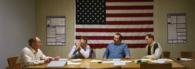
Going beyond his love for weaponry, Shambroom explores the power in the hand of corporations and even the poeple of small towns. I found this work to be my favorite as it still shows viewers that there is even power in smaller hands. His series entitled Meetings, to me, is the most entertaining and inspiring to my own work. With this work Shambroom captures moments within small city councils. He places his subject in a way to portray a portrait, as he compared them close to da Vinci's Last Supper. I believe the simplicity of composure and lightly saturated colors really gets to me. The panoramic feel really plays a huge role within this series as well. I really can't explain my love for this work, for my eyes and not my mouth can only intake the beauty.
All in all, Shambroom is an amazing photographer. Not only does this man have the knowledge behind his subjects through research, he also has a witty humorous side that left me laughing for minutes on end. Although some of his subject matter is not of my like(ie. nuclear weapons), his work has surely given me ideas on how to compose an amazing photograph.
Tuesday, February 10, 2009
First Friday Art Walk
I remember the last time I attended this art walk, burning up with the flu and wanting to punch the ever so close standing critics in each jam packed gallery. This time around was nothing new, besides more anger at those who block the sidewalks while they talk to their 20 person crowd of friends they stumbled upon.
But onto the work. It had its ups and its downs. 1708 proved to be the only eye candy of the night. Though produced by two different people, the two artists works exhibited cohesiveness in the sense of line, form, color, and texture. The simplicity of the smaller works(I do believe were done by Nichole Maury) composed of geometric shapes that carried on throughout several different pieces. I found these works to be quite interesting as I have the love for simple black on white pieces. And if you have seen my own work, I have the love for horizontal and vertical lines, often producing flat and minimalistic art. This is why these pieces stuck out to me most. On the contrast, Christopher Quirk's large canvases complimented the small, as they brought more texture from the build up of oil and acrylic. The colors used were very soothing and of my liking.
Though my time fell short Friday night due to my impatience, I did manage to stop by Quirk the proceeding Monday. To my liking there were two pieces that really took to my liking, both being that of protruding wall mounts. A piece by Elizabeth Kendall really took me in. As circular layered pieces brought similar relevance to the form of a flower, the line work of the dowel like beams popped the work into my own element. The shadows produced a wonderful effect on the wall behind, making this piece even more intriguing. Another eye popping piece that considerably took up a whole wall was that of twisted ceramic green figures. Like the previous sculpture I had explained, the shadows produced from this piece extended beautifully through extreme shape and form.
The idea of the art walk is quite smart, but since it takes place in this small, tight packed area, I do not believe it is worth my while as I get paranoid with snooty and loud cliques.
Sunday, February 1, 2009
Like father, like son.

Who: Emmet & Elijah Gowin
What: Maggie
When: Now
Where: Page Bond Gallery
Why?
This gallery is beautiful. It displays the modern day gallery feel of big open spaces in order to walk around and converse. With this only being a photographic exhibit, the sequences of images plays a major role in moving the viewer around the room. We as viewers come to know this woman named Maggie, hence the name of the exhibit. I found these pictures to be intriguing, as they are a bit mysterious in the way the camera was used to capture unusual focal lengths and imagery. The use of vignetting captures a mysterious haze on the old fashioned country home. Some pictures even capture these old women in unusual circumstances, peeping from the back of the frame, or playing with objects I have never seen in my life. There is also this feel of a journalistic view of the life around this family, documenting the years that pass.
The display of the photo's were very plain and simple, making it hard to distract the viewers attention on the photograph. The use of white matte with a light wood frame pleases the eyes when it is mounted on such white walls. This allows the eye to focus more on the image first, presentation second. We come to shows to acknowledge the works of others and to gather ideas of what is being done outside of our own work. Keep the presentation plain, and simple. This exhibit is a great example of this.
Subscribe to:
Comments (Atom)